CHS Web Design Track

Getting Started with CSS: CSS Styles and Colors

<< Previous Lesson | Next Lesson >>

Session 3.2 Visual Overview:Page Layout Grids

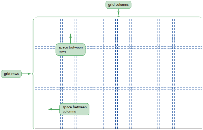
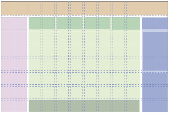
Overview of Grid-Based Layouts

  • Rows and columns form a grid
    • The number of rows is based on the page content
    • The number of columns is based on the number that provides the most flexibility in laying out the page content
  • Advantages of using a grid:
    • Grids add order to the presentation of page content
    • A consistent logical design gives readers the confidence to find the information they seek
    • It is easily accessible for users with disabilities and special needs
  • It increases the development speed with a systematic framework for the page layout

Fixed and Fluid Grids

Fixed grids –
Every column has a fixed position
  • Widths of the columns and margins are specified in pixels
Fluid grids –
Provides more support across different devices with different screen sizes.
  • Column width is expressed in percentages

CSS Frameworks

  • A framework is a software package that provides a library of tools to design a website
    • Includes style sheets for grid layouts and built-in scripts to provide support for a variety of browsers and devices
  • Some popular CSS frameworks include
    • Bootstrap
    • YAML4
    • 960 Grid System
    • Foundation 3
Class Discussion:

Find out the advantages of using a CSS framework such as Bootstrap over manually designing grids.

Setting up a Grid

  • A grid layout is based on rows of floating elements
  • Each floating element constitutes a column
  • The set of elements floating side-by-side establishes a row
  • Many grid layouts use the div (or division) element to mark distinct rows and columns of the grid
  • This is an example of a simple grid consisting of a single row with two columns:
    <div class=“row”>
        <div class=“column1”></div>
        <div class=“column2”></div>
    </div>
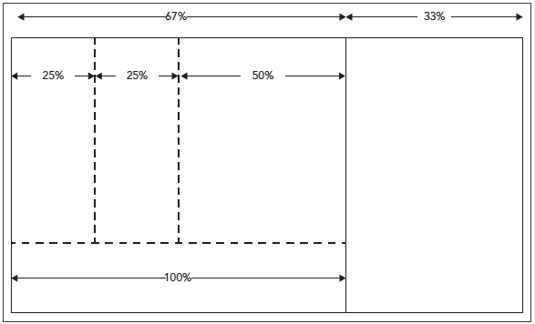
  • The page content is placed within the div elements
To create the About Pandaisia Chocolates page:
  1. Use your editor to open the pc_about_txt.html file from the html03 > tutorial folder. Enter your name and the date in the comment section and save the file as pc_about.html.

    Anne has already added the same header used for the Pandaisia Chocolates home page to this page. Using the same header tags keeps a consistent header for each page and, therefore, a consistent look and feel across pages in the website.

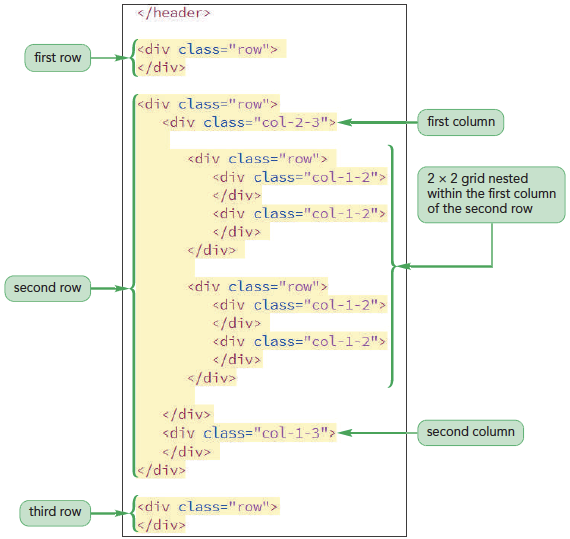
  2. Below the closing </header> tag, insert the following div elements for the first row in the grid.
    <div class=”row”>
                </div>
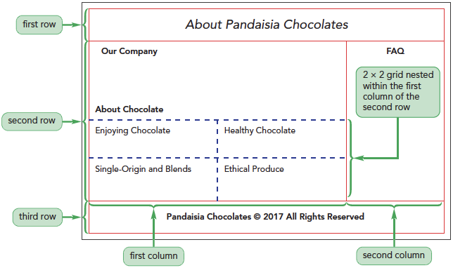
  3. Next, insert the following div elements for the second row containing two columns within the nested 2 × 2 grid in the first column.
    <div class=”row”>
        <div class=”col-2-3”>
            <div class=”row”>
                <div class=”col-1-2”>
                </div>
                <div class=”col-1-2”>
                </div>
            </div>
            <div class=”row”>
                <div class=”col-1-2”>
                </div>
                <div class=”col-1-2”>
                </div>
            </div>
        </div>
        <div class=”col-1-3”>
        </div>
    </div>
  4. Finally, insert the following div elements for the third row of the grid:
    <div class=”row”>
    </div>
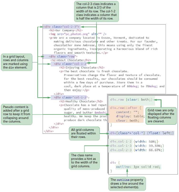
  5. Take some time to review your code, making sure that it matches the structure and class names shown in Figure 3-33.
  6. Save your changes to the file but do not close it.
Figure 3-33 highlights the complete code for the grid you've created.
Quick Quiz:
  1. True/False: A column cannot contain its own grid of rows and columns.
  2. True/False: The actual column widths are defined in style sheets.
Class Discussion:

What are your views on lorem ipsum and if it is important to use this tool.

Designing the Grid Rows

  • Grid rows contain floating columns
  • Since a grid row starts a new line within a page, it should only be displayed when both margins are clear of previously floated columns
To create styles for grid rows:
  1. Use your editor to open the pc_grids_txt.css file from the html03 > tutorial folder. Enter your name and the date in the comment section and save the file as pc_grids.css.
  2. Within the Grid Rows Styles section, insert the following style rules to ensure that rows always start on a new line once the margins are clear of previously floated columns.
    div.row {
        clear: both;
    }
  3. Add the following style rule to ensure that the grid row expands to cover all of its floating columns:
    div.row::after {
        clear: both;
        content: “”;
        display: table;
    }
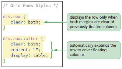
Figure 3-34 highlights the style rules for the grid rows.

Designing the Grid Columns

  • Every grid column needs to be floated within its row
  • Grid columns are placed within a div element having the general class name
    class=“col-numerator-denominator”
    where numerator-denominator provides the fractional width of the column
To float the grid columns:
  1. Within the Grid Columns Styles section, insert the following style rule:
    div[class^=”col-”] {
        float: left;
    }
  2. Save your changes to the file.
Figure 3-35 highlights the style rule for the grid columns.
To set the width of the grid columns:
  1. Within the Grid Columns Styles section, add the following style rules:
    div.col-1-1 {width: 100%;}
    div.col-1-2 {width: 50%;}
    div.col-1-3 {width: 33.33%;}
    div.col-2-3 {width: 66.67%;}
    div.col-1-4 {width: 25%;}
    div.col-3-4 {width: 75%;}
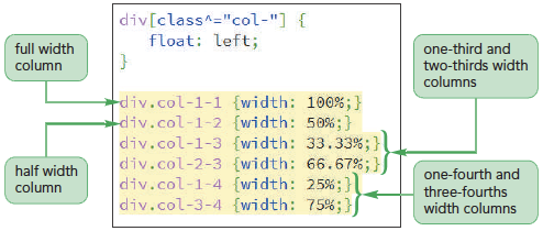
  2. Save your changes to the file.
Figure 3-36 highlights the width values assigned to div elements of different classes.

Adding the Page Content

To insert page content into the grid:
  1. Return to the pc_about.html file in your editor.
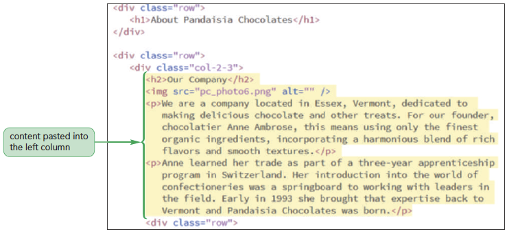
  2. Directly after the opening <div class=”row”> tag, insert the following h1 heading:
    <h1>About Pandaisia Chocolates</h1>
  3. Open the pc_text.txt file using your text editor and copy the HTML code from the About the Company section, which includes the h2 heading, an img element, and two paragraphs.
  4. Paste the copied code directly after the first <div class=”col-2-3”> tag near the top of the grid.

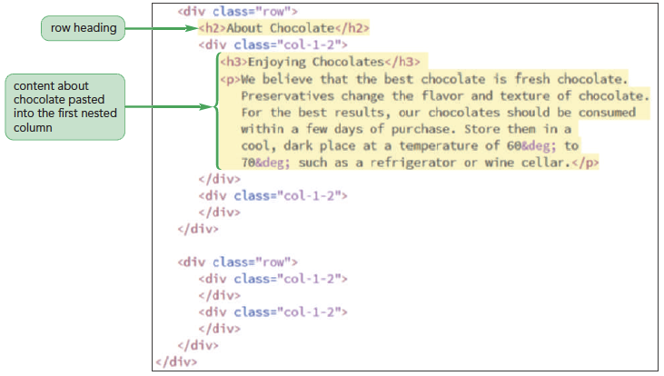
    Within the left column are two nested rows containing short articles about chocolate. You will add this content to the grid now.

  5. Directly after the nested <div class=”row”> tag, insert the heading tag <h2>About Chocolate</h2>
  6. Return to the pc_text.txt file in your editor and copy the HTML code from the first of four Enjoying Chocolates sections, which includes the h3 heading and a paragraph. Paste the copied text into the first of the four nested half-width columns, as shown in Figure 3-39.
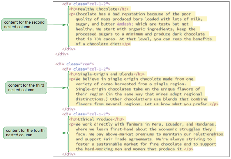
  7. Add the content for the remaining three half-width nested columns by returning to the pc_text.txt file in your editor and copying the HTML code from the last three Enjoying Chocolate sections: Healthy Chocolate, Single-Origin and Blends, and Ethical Produce. Each section includes an h3 heading and a paragraph. Paste the copied code from each section into one of the three remaining nested half-width columns. Figure 3-40 shows the placement of the copied HTML code for the last three half-width nested columns.
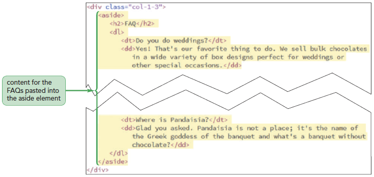
  8. The right column of the second grid row contains a list of frequently asked questions. Return to the pc_text.txt file in your editor and copy the aside element and its contents from the Frequently Asked Questions section.
  9. Return to the pc_about.html file in your editor and paste the copied code within the right column, as shown in Figure 3-41.
  10. Go to the last grid row and insert the following HTML code between the opening and closing div tags:
    <footer>Pandaisia Chocolates ©
    2017 All Rights Reserved</footer>
  11. Save your changes to the file.
Figure 3-37 shows the placement of the h1 heading in the first grid row.
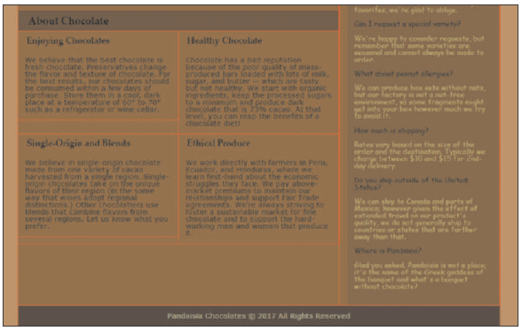
Figure 3-38 shows the placement of the left column text.
Figure 3-39 Adding content about chocolate
Figure 3-40 shows the placement of the copied HTML code for the last three half-width nested columns.
Figure 3-41 Adding content for frequently asked questions
Figure 3-42 highlights the code for the footer row in the grid. The page content for the About Pandaisia Chocolates is complete.
To link to the style sheets:
  1. Scroll to the top of the document and insert the following link elements directly after the title element:
    <link href=”pc_reset.css” rel=”stylesheet” />
    <link href=”pc_grids.css” rel=”stylesheet” />
    <link href=”pc_styles2.css” rel=”stylesheet” />
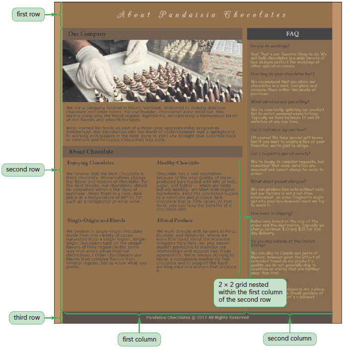
  2. Save your changes to the file and then reload the pc_about.html file in yourbrowser.
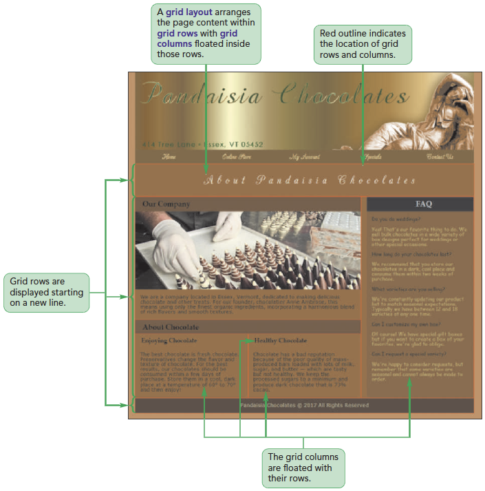
Figure 3-43 shows the final layout of the page content.

Outlining a Grid

Outlines –
Lines drawn around an element, enclosing the element content, padding, and border spaces
Outline-width: value; –
Specifies the width of a line.
  • Properties of value are: thin, medium, or thick
Outline-color: color; –
Specifies the color of a line.
  • Properties of color are: CSS color name or value
Outline-style: style; –
Specifies the design of a line
  • Properties of style are: solid, double, dotted, dashed, groove, inset, ridge, or outset
To outline the grid:
  1. Return to the pc_grids.css file in your editor.
  2. Go to the Grid Outline Styles section and insert the following style rule:
    div {
    outline: 1px solid red;
    }
  3. Save your changes to the style sheet.
  4. Reload the pc_about.html file in your browser.
  5. Close any of your open files now.
Figure 3-44 describes the use of the outline shorthand property.
Figure 3-45 shows the appearance of the part of the page with the grid lines superimposed on the page layout.
Quick Quiz:
  1. True/False: Outlines cannot be applied to inline elements.
  2. True/ False: An outline always surrounds an entire element.

Defining a CSS Grid

  • To create a grid display without the use of div elements, use the following grid-based properties:
    selector {
        display: grid;
        grid-template-rows: track-list;
        grid-template-columns: track-list;
    }
grid –
Selected elements in a grid
track-list –
Space-separated list of row heights or column widths
fr unit –
Represents the fraction of available space left on the grid after all other rows or columns have attained their maximum allowable size
  • For example, the following style creates four columns with the dimension specified in the style rule:
    grid-template-columns: 200px 250px 1fr 2fr;

Assigning Content to Grid Cells

  • Elements in a CSS grid are placed within a grid cell at the intersection of a specified row and column
  • By default, all of the specified elements are placed in the grid cell located at the intersection of the first row and first column
  • To place an element in a different cell, use
    grid-row-start: integer;
    grid-row-end: integer;
    grid-column-start: integer;
    grid-column-end: integer;
    where integer defines the starting and ending row or column that contains the content
Session 3.2 Quick Check
  1. What is the difference between a fixed grid and a fluid grid?
  2. What is a CSS framework?
  3. In a proposed grid, all of the grid rows have the class name container. Create a style rule to expand those grid rows around their floating columns.
  4. In a proposed grid, the columns all have the class names “span-integer” where integer indicates the size of the column. Create a style rule to float every grid column on the left margin.
  5. Create a style rule to set the width of columns belonging to the span-4 class to 25% of the row width.
  6. What is lorem ipsum?
  7. Create a style rule for the grid rows described in question 3 above so that their sizes are measured using the Border Box model.
  8. Create a style that adds a 2 pixel green dotted outline around all block quotes in the document.
  9. Using the proposed specifications for CSS-based grids, create a grid for the body element that has three rows with heights automatically defined by the page content and five columns with widths of 25%, 2.5%, 50%, 2.5%, and 20%. Place the nav element in the first column, the article element in the third column, and the aside element in the fifth column.
<< Previous Lesson | Next Lesson >>