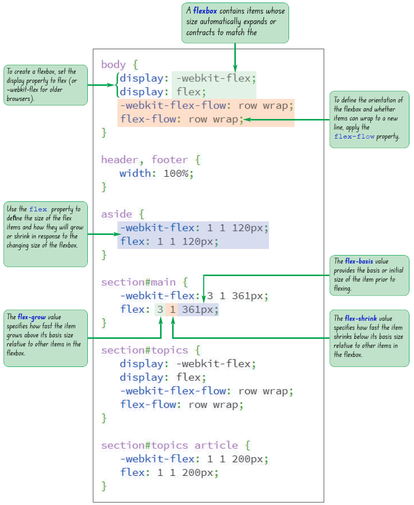


display: flex;
display: inline-flex;
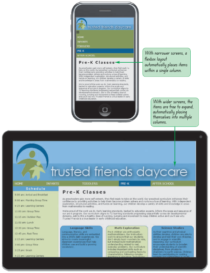
flex starts the flexbox on a new line and a value of inline-flex keeps the flexbox in-line with its surrounding content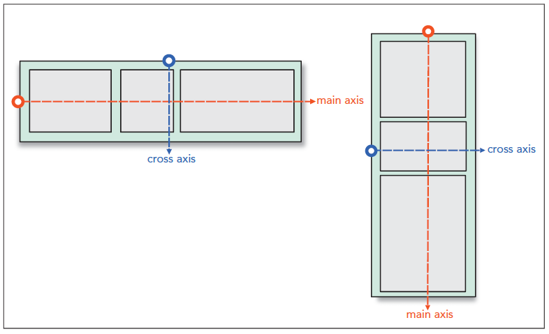
Research the latest WebKit browser extension and the current W3C specifications.
display: -webkit-box;display: -moz-box;display: -ms-flexbox;display: -webkit-flex:display: flex;flex-direction: direction;
direction is row (the default), column, row-reverse, or column-reverserow option in a flex-direction lays out the flex items from left to rightcolumn option in a flex-direction creates a vertical layout starting from the top and moving downwardrow-reverse and column-reverse options in a flex-direction lay out the items bottom-to-top and right-to-left respectivelyflex-wrap: type;
nowrap (the default)wrap to wrap the flex items to a new linewrap-reverse to wrap flex items to a new line starting in the opposite direction from the current line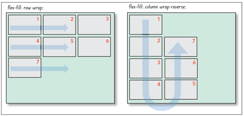
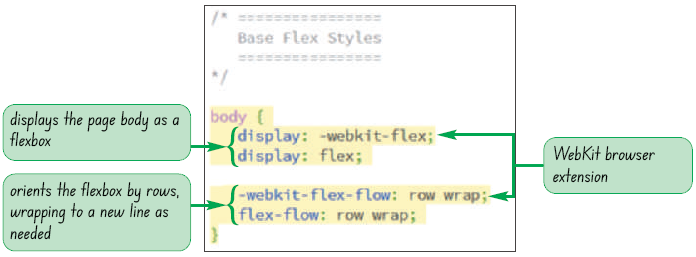
tf_prek_txt.html and tf_flex_txt.css files from the html05 › tutorial folder. Enter your name and the date in the comment section of each file and save them as tf_prek.html and tf_flex.css respectively.tf_prek.html file in your editor and, within the document head, create links to the tf_reset.css, tf_styles2.css, and tf_flex.css style sheets in that order.tf_flex.css file in your editor.body {
display: -webkit-flex;
display: flex;
-webkit-flex-flow: row wrap;
flex-flow: row wrap;
}
flex-basis: size;
size is one of the CSS units of measurement, which sets the initial size of the flex item based on its content or the value of its width or height propertyaside {
flex-basis: 200px;
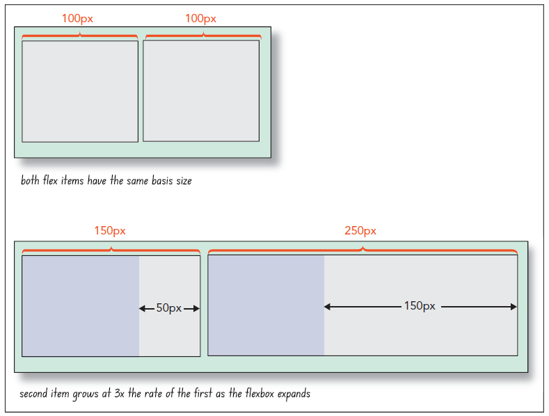
}flex-grow: value;
value is a non-negative value that expresses the growth of the flex item relative to the growth of the other items in the flexboxflex-grow value is 0, which is equivalent to the flex item remaining at its basis sizenav ul {
display: flex;
}
nav ul li {
flex-basis: 0px;
flex-grow: 1;
}
flex-shrink: value;
value is a non-negative value that expresses the shrink rate of the flex item relative to the shrinkage of the other items in the flexboxflex-shrink value is 1flex-shrink value is set to 0, then the flex item will not shrink below its basis value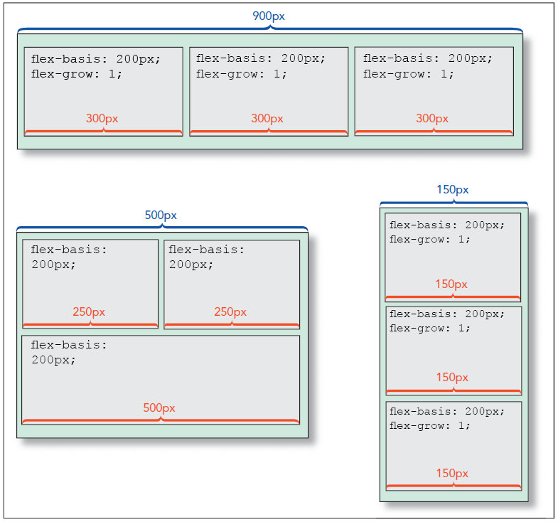
flex: grow shrink basis;
grow defines the growth of the flex item, shrink provides its shrink rate, and basis sets the item's initial sizeflex: 0 1 auto;
width and height propertyflex property supports the following keywords:
auto ‐ Use to automatically resize the item from its default size (equivalent to flex: 1 1 auto;)initial ‐ The default value (equivalent to flex: 0 1 auto;)none ‐ Use to create an inflexible item that will not grow or shrink (equivalent to flex: 0 0 auto;)inherit ‐ Use to inherit the flex values of its parent element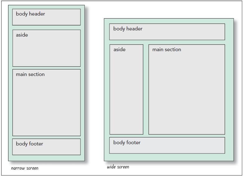
tf_flex.css file in your editor, add the following style rules to the
Base Flex Styles section:header, footer {
width: 100%;
}
aside {
-webkit-flex: 1 1 120px;
flex: 1 1 120px;
}
section#main {
-webkit-flex: 3 1 361px;
flex: 3 1 361px;
}tf_prek.html file in your web browser.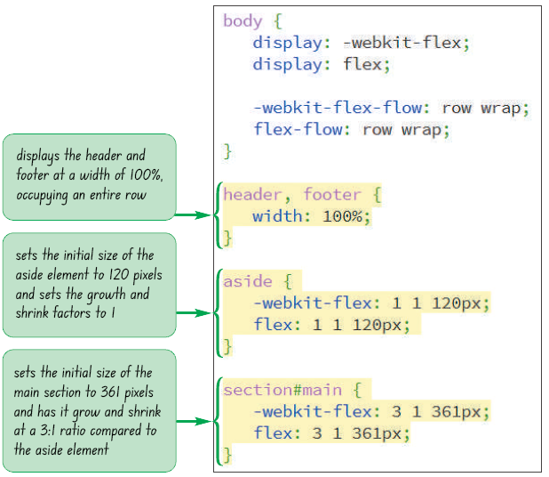
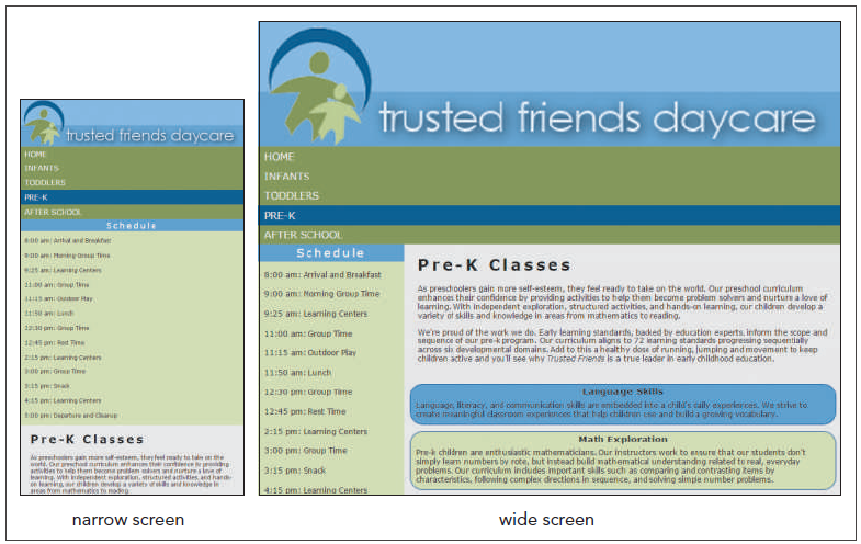
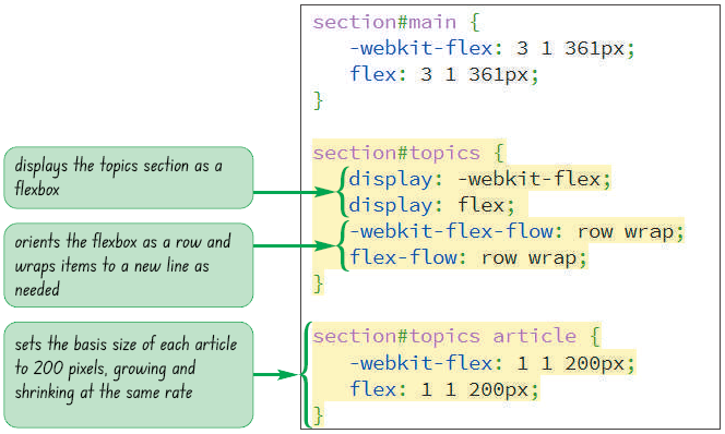
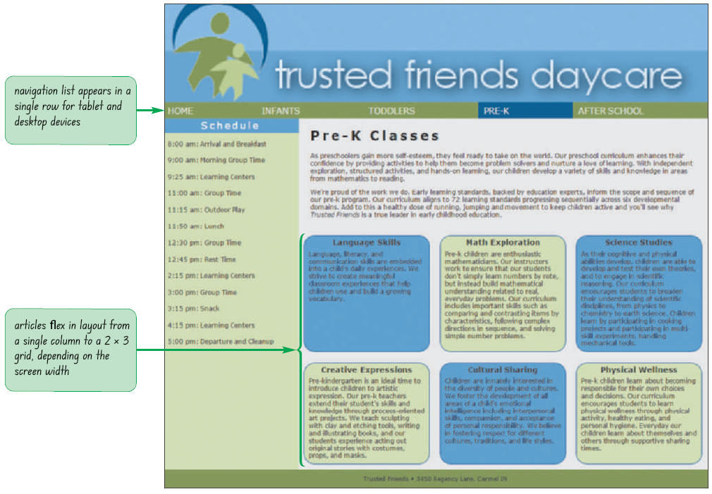
tf_flex.css file in your editor and go to the Base Flex Styles section.section#topics {
display: -webkit-flex;
display: flex;
-webkit-flex-flow: row wrap;
flex-flow: row wrap;
}
section#topics article {
-webkit-flex: 1 1 200px;
flex: 1 1 200px;
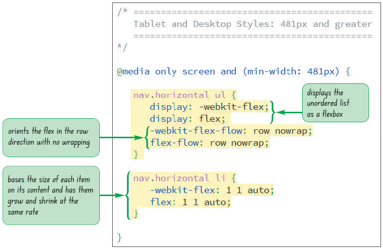
}nav.horizontal ul {
display: -webkit-flex;
display: flex;
-webkit-flex-flow: row nowrap;
flex-flow: row nowrap;
}
nav.horizontal li {
-webkit-flex: 1 1 auto;
flex: 1 1 auto;
}
Compare the align-items and align-content properties. Ask them to list out the major differences between them.
order: value;
value is an integer where items with smaller order values are placed before items with larger order valuestf_flex.css file in your editor and go to the Mobile Devices media query.aside {
-webkit-order: 99;
order: 99;
}
footer {
-webkit-order: 100;
order: 100;
}aside and footer elements.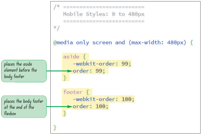
justify-content property justify-content: placement;
placement is one of the following keywords:
flex-start ‐ Items are positioned at the start of the main axis (the default)flex-end ‐ Items are positioned at the end of the main axiscenter ‐ Items are centered along the main axisspace-between ‐ Items are distributed evenly with the first and last items aligned with the start and end of the main axisspace-around ‐ Items are distributed evenly along the main axis with equal space between them and the ends of the flexbox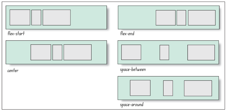
align-content: value;
value is one of the following keywords:
flex-start ‐ Lines are positioned at the start of the cross axisflex-end ‐ Lines are positioned at the end of the cross axisstretch ‐ Lines are stretched to fill up the cross axis (the default)center ‐ Lines are centered along the cross axisspace-between ‐ Lines are distributed evenly with the first and last lines aligned with the start and end of the cross axisspace-around ‐ Lines are distributed along the cross axis with equal space between them and the ends of the cross axis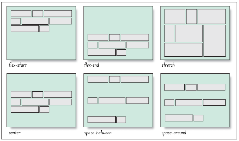
align-items property aligns each flex item about the cross axisalign-items: value;
value is one of the following keywords:
flex-start ‐ Items are positioned at the start of the cross axisflex-end ‐ Items are positioned at the end of the cross axiscenter ‐ Items are centered along the cross axisstretch ‐ Items are stretched to fill up the cross axis (the default)baseline ‐ Items are positioned so that the baselines of their content alignalign-items property is only impactful when there is a single line of flex itemsalign-content property is used to layout the flexbox content for multiple lines of flex itemsalign-self property:align-self: value;
value is one of the alignment choices supported by the align-self property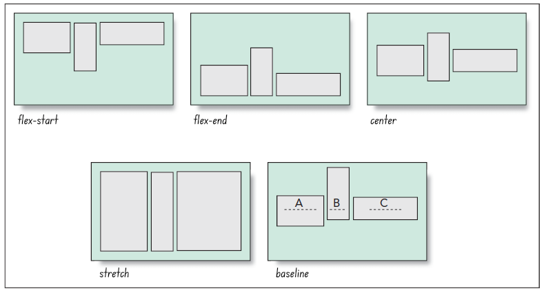
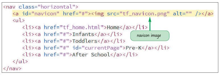
tf_prek.html file in your editor.<a id=”navicon” href=”#”>
<img src=”tf_navicon.png” alt=”” />
</a>
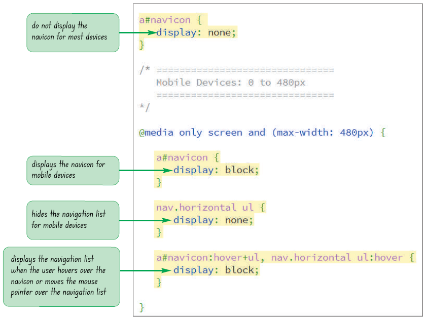
tf_prek.html file, add a link to the tf_navicon.css style sheet file after the link for the vtf_flex.css file. Save your changes to the file.tf_navicon_txt.css files from the html05 › tutorial folder. Enter your name and the date in the comment section of the file and save it as tf_navicon.css.a#navicon {
display: none;
}a#navicon {
display: block;
}nav.horizontal ul {
display: none;
}a#navicon:hover+ul, nav.horizontal ul:hover {
display: block;
}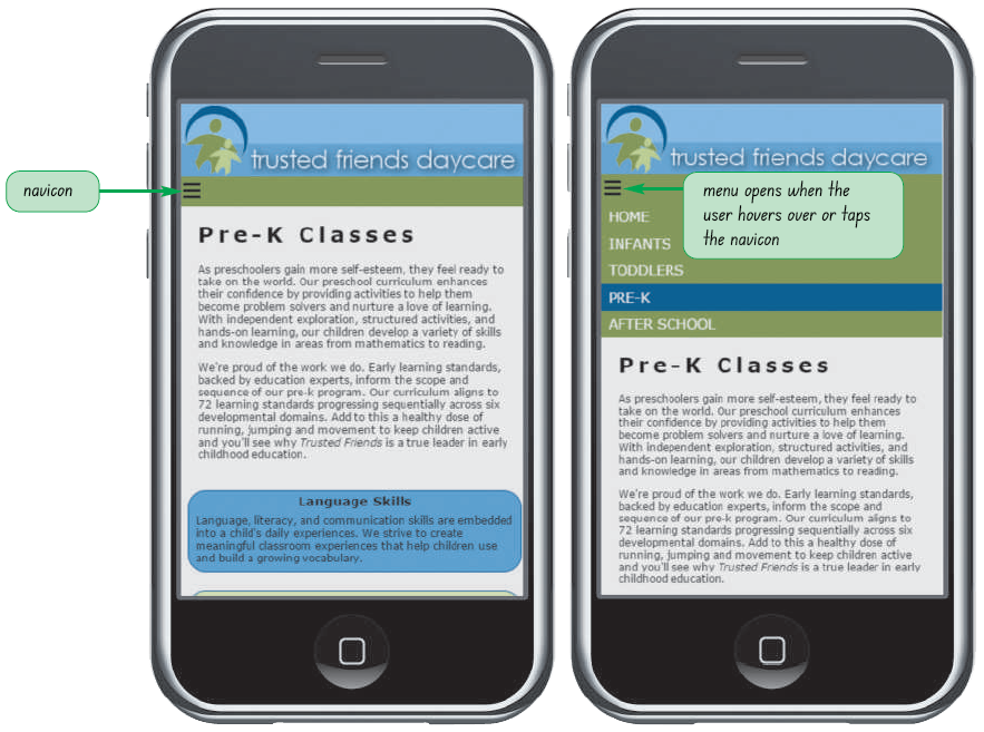
Relate similar examples of symbols which they have seen in websites.
Discuss the advantages of minifying.