

transform: effect(params);
effect is the transformation function that will be applied to page objectsparams specify the parameters required by the transformation function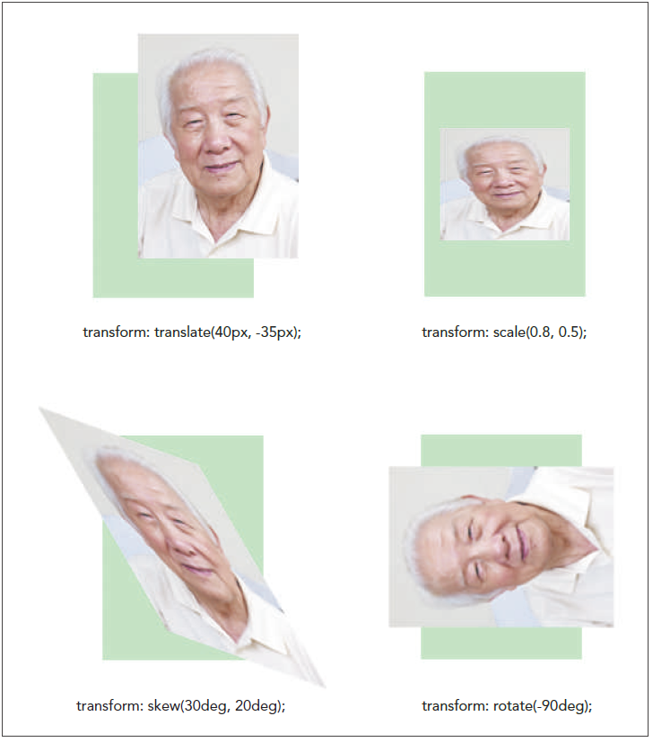
| Function | Description |
|---|---|
| translate(offX, offY) | Moves the object offX pixels to the right and offY pixels down; negative values move the object to the left and up |
| translateX(offX) | Moves the object offX pixels to the right; negative values move the object to the left |
| translateY(offY) | Moves the object offY pixels down; negative values move the object up |
| scale(x, y) | Resizes the object by a factor of x horizontally and a factor of y vertically |
| scaleX(x) | Resizes the object by a factor of x horizontally |
| scaleY(y) | Resizes the object by a factor of y horizontally |
| skew(angleX, angleY) | Skews the object by angleX degrees horizontally and angleY degrees vertically |
| skewX(angleX) | Skews the object by angleX degrees horizontally |
| skewY(angleY) | Skews the object by angleY degrees vertically |
| rotate(angle) | Rotates the object by angle degrees clockwise; negative values rotate the object counter-clockwise |
| matrix(n, n, n, n, n, n) | Applies a 2D transformation based on a matrix of six values |
tb_genta_txt.html and tb_visual2_txt.css files from the html04 > tutorial folder. Enter your name and the date in the comment section of both files and save them as tb_genta.html and tb_visual2.css respectively.tb_genta.html file in your editor. Within the document head, insert the following link elements to link the page to the tb_reset.css, tb_styles2.css, and tb_visual2.css style sheet files. <link href=”tb_reset.css” rel=”stylesheet” />
<link href=”tb_styles2.css” rel=”stylesheet” />
<link href=”tb_visual2.css” rel=”stylesheet” />
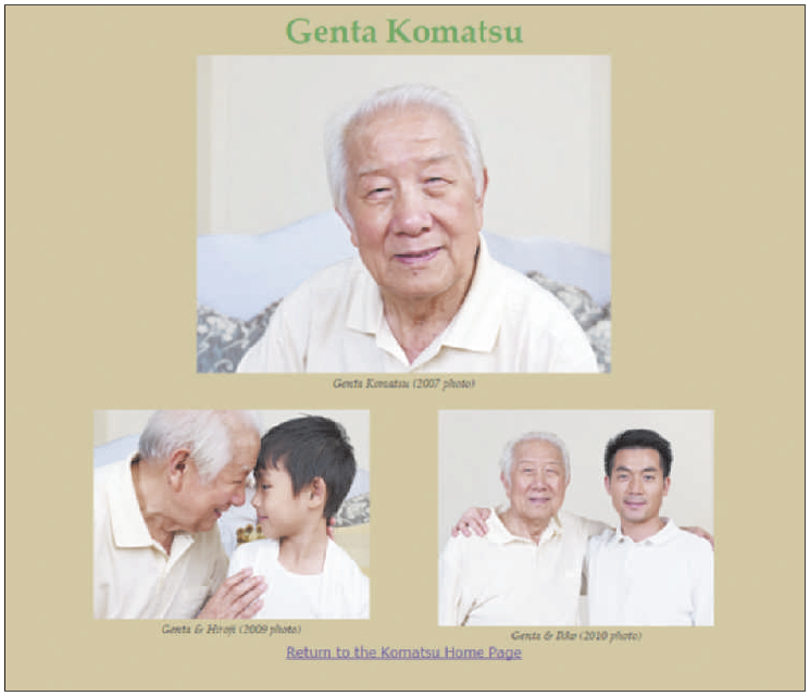
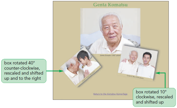
tb_genta.html file in your browser. Figure 4-47 shows the initial layout and design of the page content.tb_visual2.css file in your editor and scroll as needed to the Transformation Styles section.figure#figure2 {
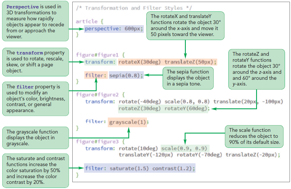
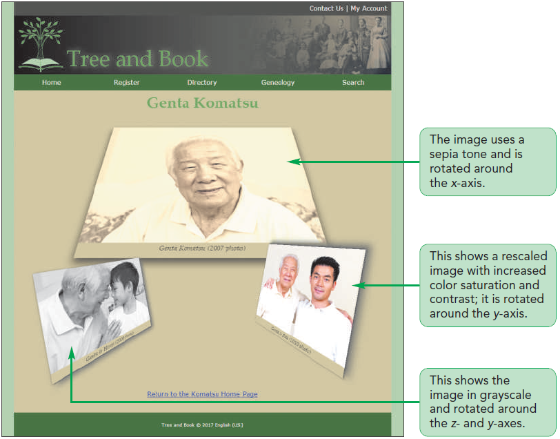
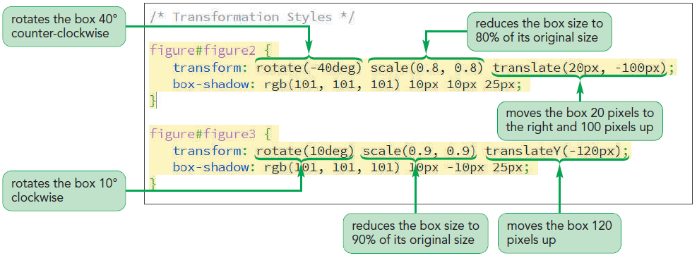
transform: rotate(-40deg) scale(0.8, 0.8)
translate(20px, -100px);
box-shadow: rgb(101, 101, 101) 10px 10px 25px;
}figure#figure3 {
transform: rotate(10deg) scale(0.9, 0.9)
translateY(-120px);
box-shadow: rgb(101, 101, 101) 10px -10px 25px;
}
| Function | Description |
|---|---|
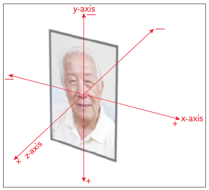
| translate3d(offX, offY, offZ) | Shifts the object offX pixels horizontally, offY pixels vertically, and offZ pixels along the z-axis |
| translateX(offX) translateY(offY) translateZ(offZ) | Shifts the object offX, offY, or offZ pixels along the specified axis |
| rotate3d(x, y, z, angle) | Rotates the object around the three-dimensional vector (x, y, z) at a direction of angle |
| rotateX(angle) rotateY(angle) rotateZ(angle) | Rotates the object around the specified axis at a direction of angle |
| scale3d(x, y, z) | Resizes the object by a factor of x horizontally, a factor of y vertically, and a factor of z along the z-axis |
| scaleX(x) scaleY(y) scaleZ(z) | Resizes the object by a factor of x, y, or z along the specified axis |
| perspective(p) | Sets the size of the perspective effect to p |
| matrix3d(n, n, …, n) | Applies a 3D transformation based on a matrix of 16 values |
perspective: value;
value is a positive value that measures the strength of the perspective effectvalue results in more extreme distortion
tb_visual2.css file in your editor.article {
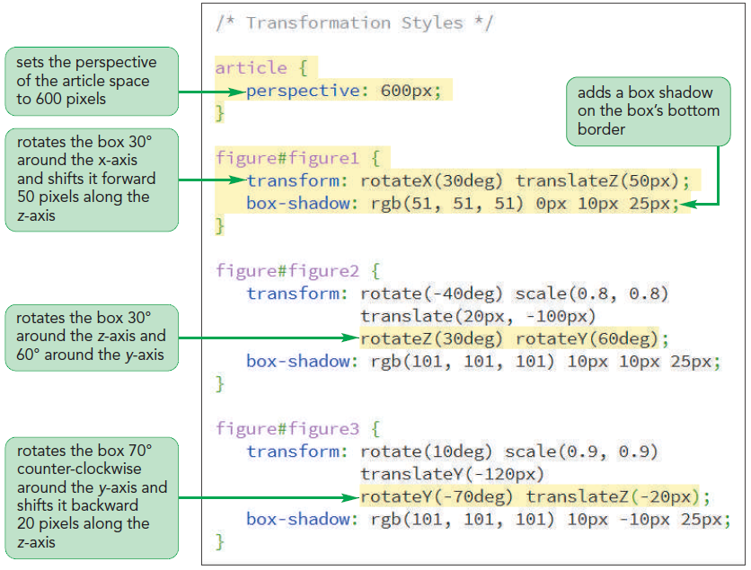
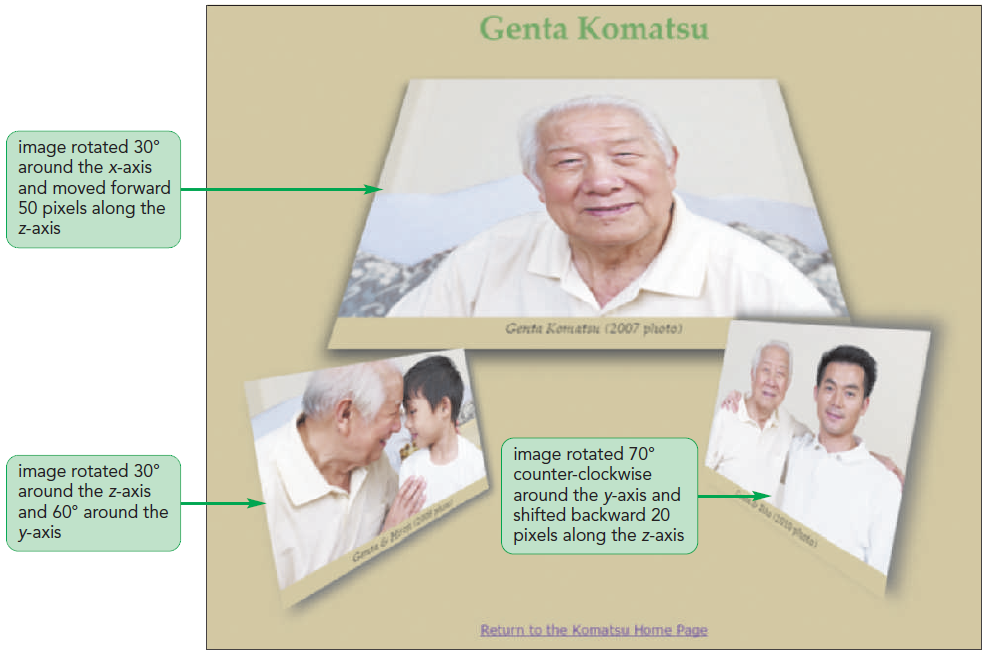
perspective: 600px;
}figure#figure1 {
transform: rotateX(30deg) translateZ(50px);
box-shadow: rgb(51, 51, 51) 0px 10px 25px;
}rotateZ(30deg) rotateY(60deg)
rotateY(-70deg) translateZ(-20px)
Find a few examples of websites using different 2D and 3D functions. Identify the functions used in them.
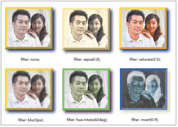
filter: effect(params);
effect is a filter functionparams specify the parameters of filter function| Function | Description |
|---|---|
| blur(length) | Applies a blur to the image where length defines the size of blur in pixels |
| brightness(value) | Adjusts the brightness where values from 0 to 1 decrease the brightness and values greater than 1 increase the brightness |
| contrast(value) | Adjusts the contrast where values from 0 to 1 decrease the contrast and values greater than 1 increase the contrast |
| drop-shadow(offsetX offsetY blur color) | Adds a drop shadow to the image where offsetX and offsetY are horizontal and vertical distances of the shadow, blur is the shadow blurring, and color is the shadow color |
| grayscale(value) | Displays the image in grayscale from 0, leaving the image unchanged, up to 1, displaying the image in complete grayscale |
| hue-rotate(angle) | Adjusts the hue by angle in the color wheel where 0deg leaves the hue unchanged, 180deg displays the complimentary colors and 360deg again leaves the hue unchanged |
| invert(value) | Inverts the color from 0 (leaving the image unchanged), up to 1 ( completely inverting the colors) |
| opacity(value) | Applies transparency to the image from 0 (making the image transparent), up to 1 (leaving the image opaque) |
| saturate(value) | Adjusts the color saturation where values from 0 to 1 decrease the saturation and values greater than 1 increase the saturation |
| sepia(value) | Displays the color in a sepia tone from 0 (leaving the image unchanged), up to 1 (image completely in sepia) |
| url(url) | Loads an SVG filter file from url |
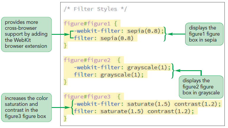
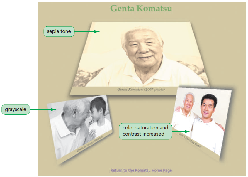
tb_visual2.css file in your editor and go down to the Filter Styles section.figure#figure1 {
-webkit-filter: sepia(0.8);
filter: sepia(0.8)
}figure#figure2 {
-webkit-filter: grayscale(1);
filter: grayscale(1);
}figure#figure3 {
-webkit-filter: saturate(1.5) contrast(1.2);
filter: saturate(1.5) contrast(1.2);
}
<map name=“text”>
        hotspots
    </map>
text is the name of the image maphotspots are the defined regions within an image that are linked to different URLs<area shape=“shape” coords=“coordinates”
href=“url” alt=“text” />shape=“circle” coords=“x, y, radius”
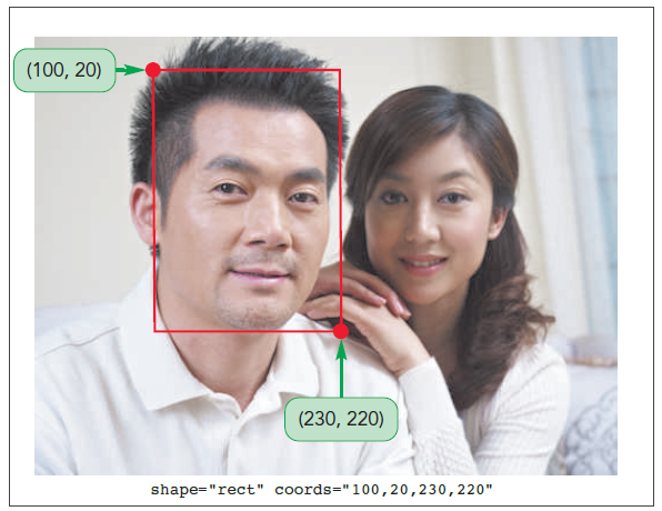
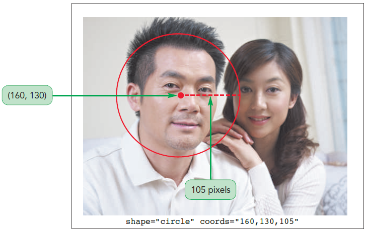
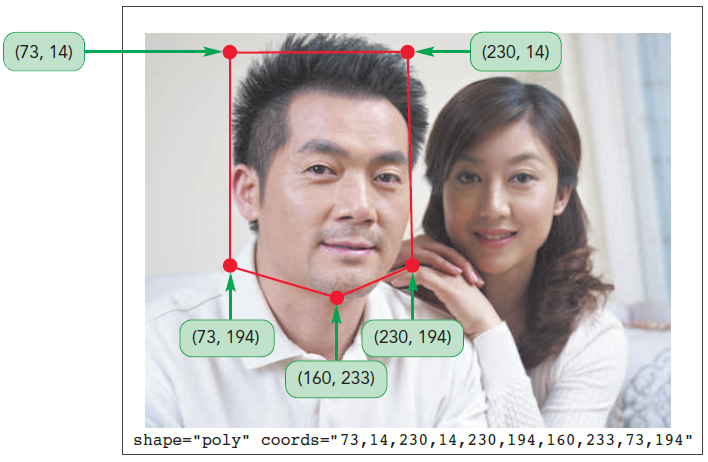
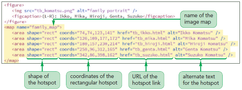
tb_komatsu.html file in your editor.<map name=”family_map”>
<area shape=”rect” coords=”74,74,123,141”
href=”tb_ikko.html” alt=”Ikko Komatsu” />
<area shape=”rect” coords=”126,109,177,172”
href=”tb_mika.html” alt=”Mika Komatsu” />
<area shape=”rect” coords=”180,157,230,214”
href=”tb_hiroji.html” alt=”Hiroji Komatsu” />
<area shape=”rect” coords=”258,96,312,165”
href=”tb_genta.html” alt=”Genta Komatsu” />
<area shape=”rect” coords=”342,86,398,162”
href=”tb_suzuko.html” alt=”Suzuko Komatsu” />
</map>
<img src=“url” alt=“text” usemap=“#map” />
map is the name assigned to the image map within the current HTML fileusemap=”#family_map” to the img element for the family portrait.
Search the Internet for several websites that use image maps. Then evaluate and critique the maps, explaining what it is you like or dislike about the maps. Pay particular attention to the quality and accuracy of the hotspots within each map.