CHS Web Design Track

HTML5 and CSS3 7th Edition

Tutorial 4 Graphic Design with CSS

«Previous Lesson | Next Lesson »

Session 4.2

Creating a Text Shadow

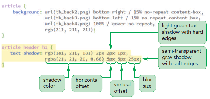
  • A shadow can be added to a text on a page, to give the text a visual impact, by using the following property:
    text-shadow: color offsetX offsetY blur;
    • color is the shadow color
    • offsetX and offsetY are the distances of the shadow from the text in the horizontal and vertical directions
    • blur creates a blurred effect by spreading out a shadow
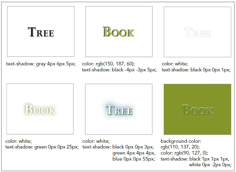
Examples of text shadows
To add a text shadow:
  1. If you took a break after the previous session, reopen or return to the tb_visual1.css file in your editor and scroll to the Article Styles section.
  2. Add the following style for the h1 heading in the article header:
    article header h1 {
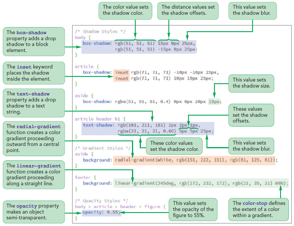
    text-shadow: rgb(181, 211, 181) 2px 2px 1px,
                rgba(21, 21, 21, 0.66) 5px 5px 25px;
    }
  3. Save your changes and reload tb_komatsu.html in your browser.
Figure 4-23 highlights the style to add text shadows to the h1 heading.
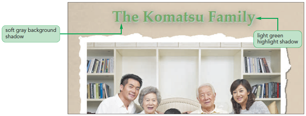
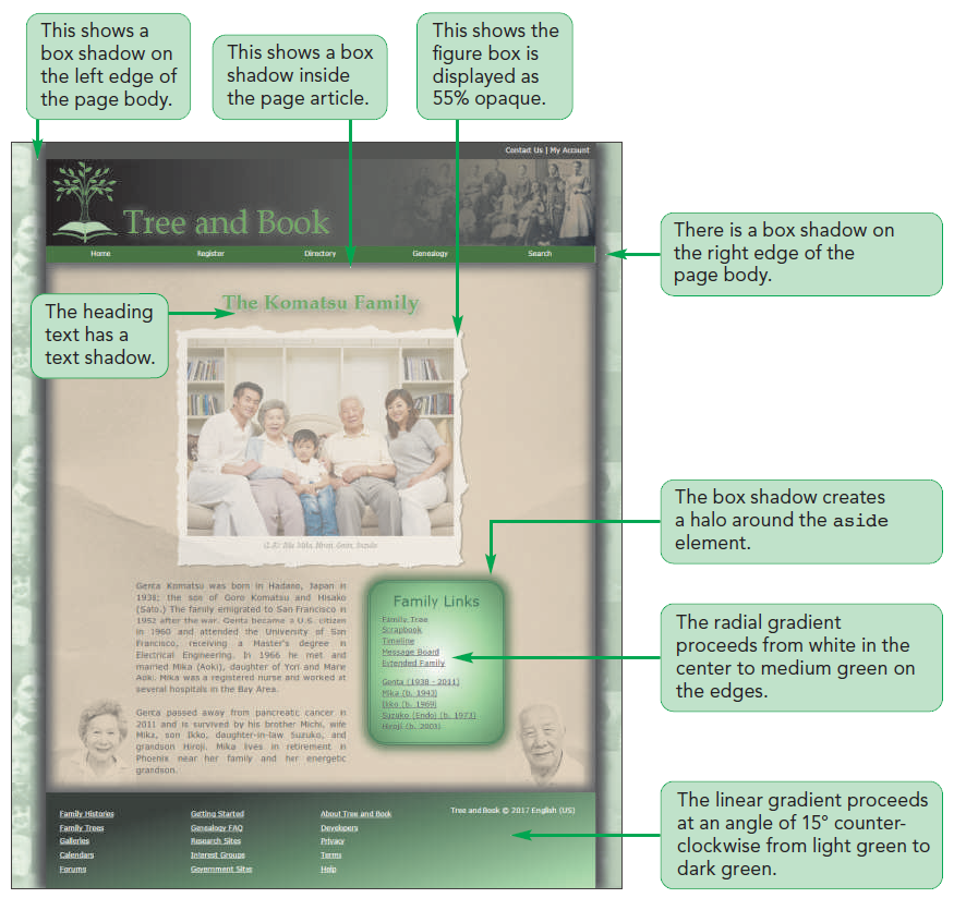
Figure 4-24 shows the shadow effect added to the h1 heading.

Creating a Box Shadow

  • Any block element can be shadowed by using the box-shadow property:
    box-shadow: color offsetX offsetY blur;
    where color, offsetX, offsetY, and blur have the same meanings for box shadows as they do for text shadows
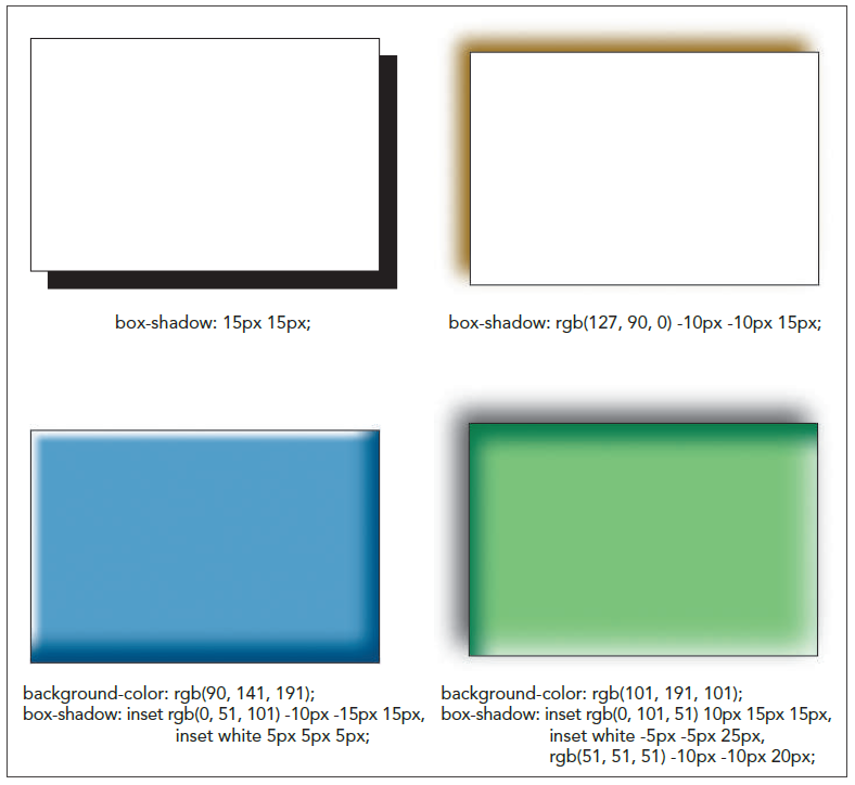
  • Multiple shadows can be added by including them in a comma-separated list
To add a box shadow:
  1. Return to the tb_visual1.css file in your editor and go to the Page Body Styles section.
  2. Within the style rule for the body element, insert the following styles:
    box-shadow: rgb(51, 51, 51) 15px 0px 25px,
    rgb(51, 51, 51) -15px 0px 25px;
  3. Save your changes and reload tb_komatsu.html in your browser.
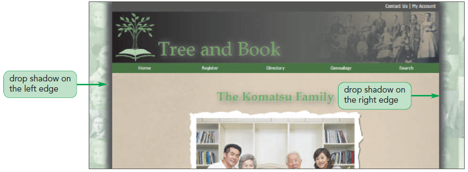
Figure 4-25 highlights the style to add box shadows to the page body.
Figure 4-26 shows the drop shadows added to the page body.
 
To increase the shadow size:
  1. Return to the tb_visual1.css file in your editor and go to the Asides Styles section.
  2. Within the style rule for the aside element, insert the following style:
    box-shadow: rgba(51, 91, 51, 0.4) 0px 0px 20px 10px;
  3. Save your changes and reload tb_komatsu.html in your browser.
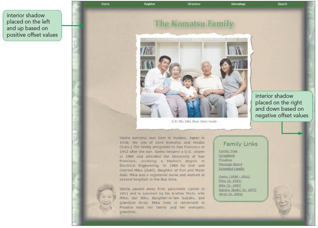
Figure 4-30 highlights the style to add a halo to the aside element.
Figure 4-31 shows the revised appearance of the aside element with the glowing green shadow.
 

Quick Quiz:

  1. True/False: As the blur value increases in a text shadow, the edge of the shadow becomes more distinct.
  2. True/ False: Box shadows can be placed inside the element as well as outside.

Applying a Color Gradient

Gradients and Color Stops

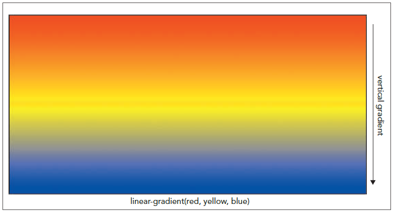
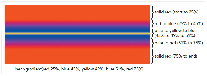
  • The colors specified in a gradient are evenly distributed
  • The following gradient starts with a solid red, solid green appears halfway through the gradient, and finishes with solid blue:
    background: linear-gradient(red, green, blue)
To apply a linear gradient:
  1. Return to the tb_visual1.css file in your editor and go to the Footer Styles section.
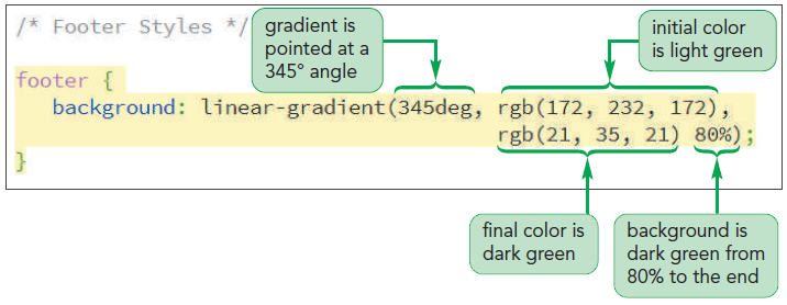
  2. Insert the following style rule for the footer element:
    footer {
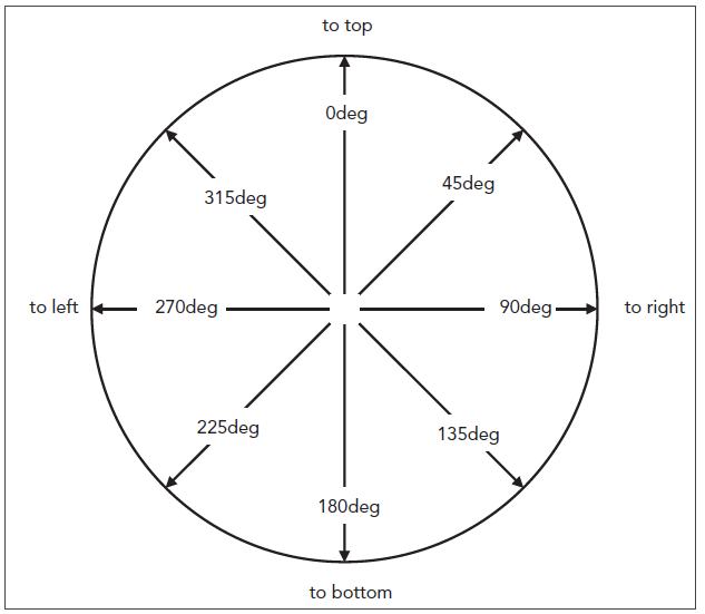
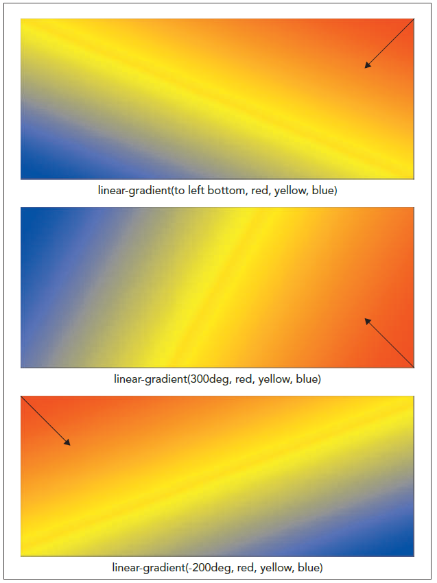
    background: linear-gradient(345deg, rgb(172, 232, 172),
                                        rgb(21, 35, 21) 80%);
    }
  3. Save your changes and reload tb_komatsu.html in your browser.
Figure 4-36 highlights the style to create the linear gradient.
Figure 4-37 shows the revised appearance of the page footer with a linear gradient.

Creating a Radial Gradient

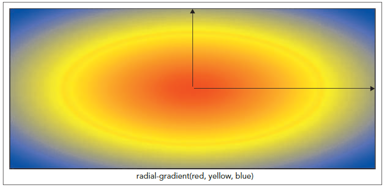
  • Radial gradient:
    • It is a color gradient that starts from a central point
    • It proceeds outward in a series of concentric circles or ellipses
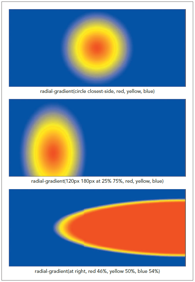
  • Radial gradients are created using the following radial-gradient function:
    radial-gradient(shape size at position, color-stop1, color-stop2, …)
    • shape defines the shape of the gradient
    • position defines where the gradients radiate from
    • color-stop1, color-stop2, … specify the colors and their stopping positions
  • The size value in the radial-gradient function:
    • defines the extent of the gradient as it radiates outward
    • can be expressed with a CSS unit of measure
    • can be expressed as a percentage of the background’s width and height
    • can also be expressed with one of the following keywords: farthest-corner (the default), farthest-side, closest-corner, and closest-side
To apply a radial gradient:
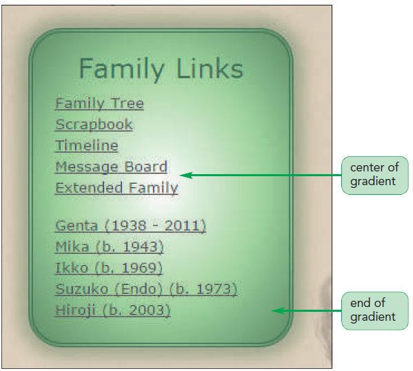
  1. Return to the tb_visual1.css file in your editor and go to the Aside Stylessection.
  2. Add the following style to the style rule for the aside element:
    background: radial-gradient(white, rgb(151, 222, 151),
                rgb(81, 125, 81));
  3. Save your changes and reload tb_komatsu.html in your browser.
Figure 4-41 shows the radial gradient within the aside element.

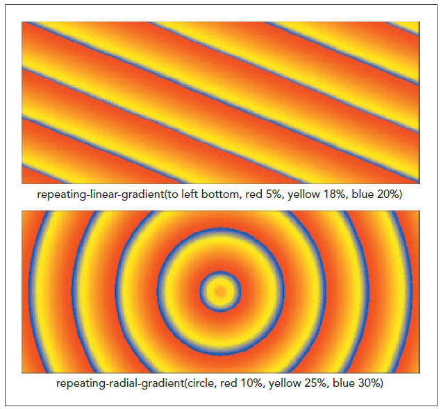
Repeating a Gradient

Class Discussion:

Compare the linear and radial gradients.

Creating Semi-Transparent Objects

To create a semi-transparent object:
  1. Return to the tb_visual1.css file in your editor and scroll up to the Figure Box Styles section.
  2. Within the style rule for the figure element, insert the following style:
    opacity: 0.55;
  3. Save your changes and reload tb_komatsu.html in your browser.
Figure 4-43 highlights the code to make the figure box semi-transparent.
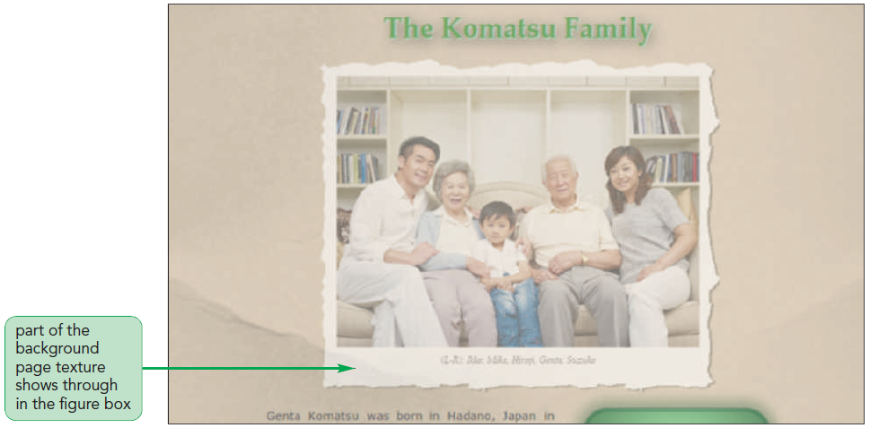
Figure 4-44 displays the semi-transparent figure box with part of the background paper texture showing through.
 

Quick Quiz:

  1. True/False: The opacity value 0 indicates that the object is completely opaque.
  2. What value of the opacity property makes an object completely transparent?
 
Session 4.2 Quick Check
  1. Provide code to add a red text shadow to all h1 headings; the shadow should be offset 5 pixels to the left and 10 pixels down with a blur of 7 pixels.
  2. Add a gray box shadow to all aside elements; the shadow should be placed 2 pixels to the left and 5 pixels above the element with a blur of 10 pixels.
  3. Add an inset gray shadow to all footers; the shadow should be offset by 10  pixels to the left and 15 pixels down with a blur of 5 pixels.
  4. Create a red halo effect around the main element with no shadow offset, a blur of 15 pixels and a shadow size that is 10 pixels larger than the element.
  5. Provide code for a linear gradient that moves in the direction of the lower-left corner of the element through the colors: orange, yellow, and green.
  6. Create a linear gradient that moves at a 15 degree angle with the color orange stopping at 10% of the background, yellow stopping at 50%, and green stopping at 55%.
  7. Create a radial gradient that extends to the farthest background corner, going through the colors orange, yellow, and green.
  8. Create a repeating circular gradient of orange, yellow, and green bands centered at the right edge of the element with the colors stopped at 10%, 20%, and 30% respectively.
  9. Create a style rule to set the opacity of all inline images to 75%.
«Previous Lesson | Next Lesson »